The Ins and Outs of A Retoucher:
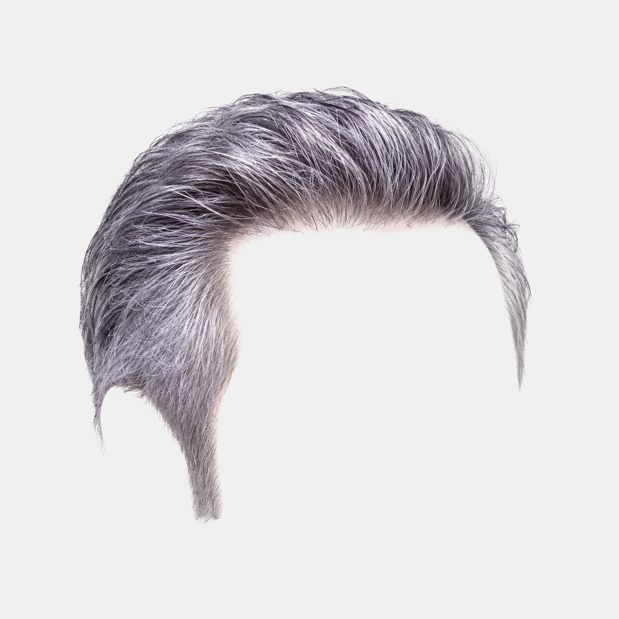
Can you render me a hairdoo like right guy that I can just replace left guys? Edit Edit Yesterday 11:51 PM clinet says, 'nice, just a little more shadow constrast?
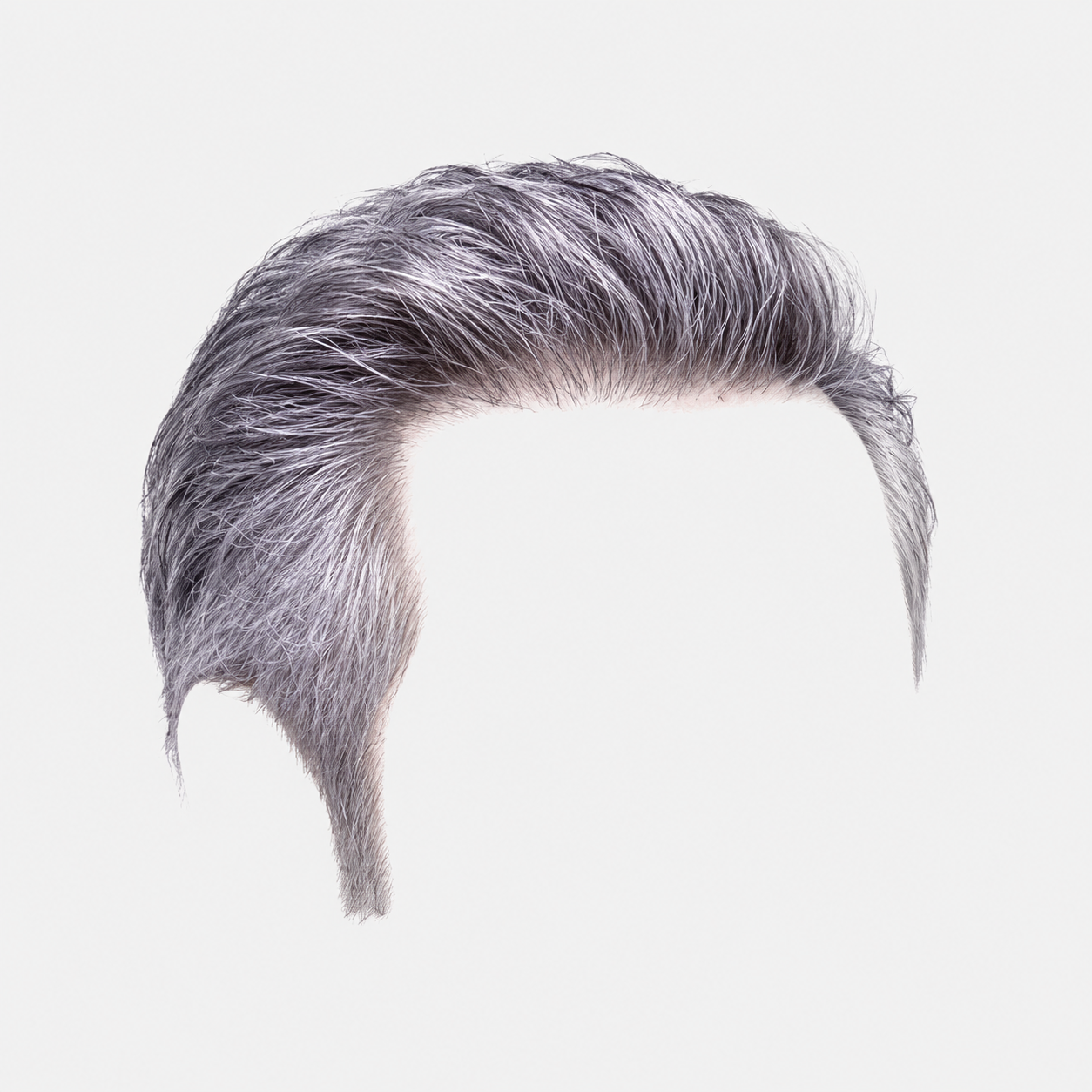
Yep — that note usually means:
“Keep the overall brightness where it is, but give the darker values a little more shape/depth.”
In this image, I’d read that as:
a little more definition in the face shadows a little more form in the sweater folds maybe a touch more depth in the hair/beard not making him overall darker Fastest move Curves layer clipped to left guy
Make a very gentle S-curve, but bias it toward the darks:
add a point in the lower mids / shadow zone pull it down just a little keep highlights mostly where they are
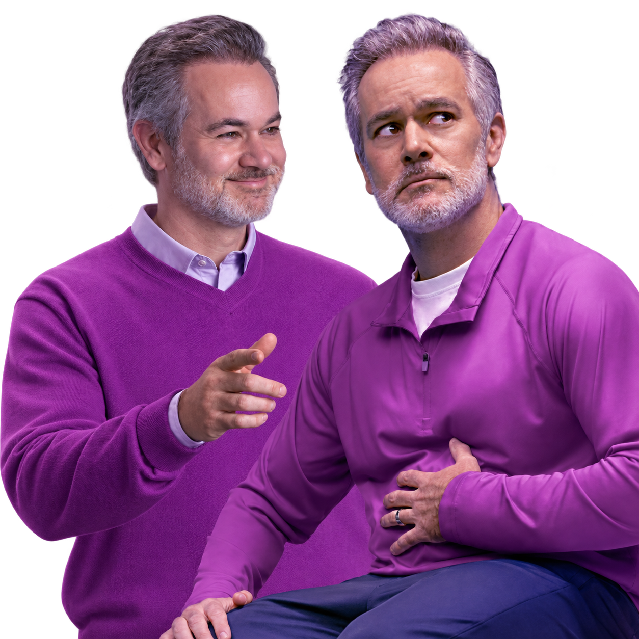
Think:
shadows: slightly deeper mids: mostly same highlights: protected
If you’re in Camera Raw:
Contrast +5 to +10 Shadows -8 to -15 Blacks -3 to -8
That’s probably enough.
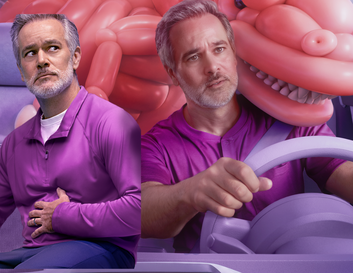
Where I’d target it 1. Face
His face is a little creamy/flat compared with approved guy.
Add a subtle darkening to:
under cheekbone side of nose under lower lip jawline eye sockets/crow’s foot area very lightly
Not painted-looking — just a little more sculpting.
- Hair and beard
The hair is good now, but could use a touch more internal depth.
Use a Curves or Levels layer on the hair/beard and deepen:
roots underside of swept hair beard under cheek/jaw
Just a little. The silver highlights should still pop.
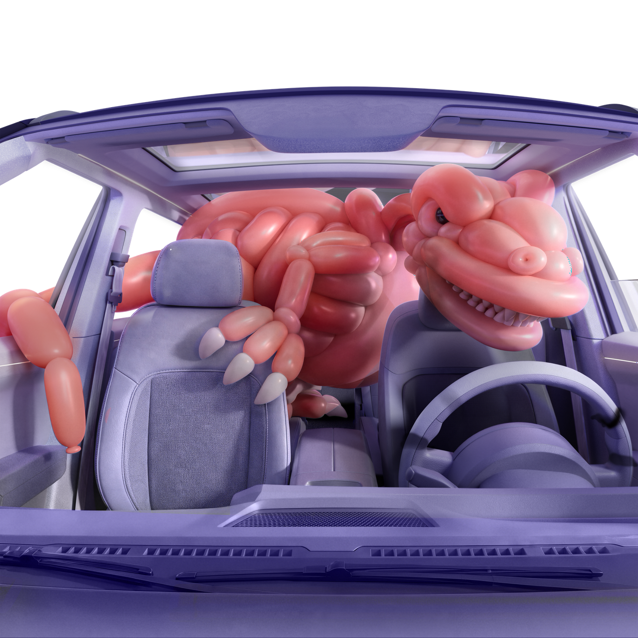
- Sweater
This is probably where the client is feeling “flat.” The sweater can take a touch more contrast in:
under the arm side seams folds around the elbow/cuff under the chest / rib area
A subtle Multiply layer at low opacity or a Curves darken layer masked into folds works great.
Best Photoshop move
If you want the safest, most controllable route:
Add Curves Pull down shadow region slightly Fill mask black Paint in with soft white brush at 10–20% Hit only: face form shadows beard depth sweater folds maybe pant folds What not to do Don’t lower overall exposure Don’t crush blacks Don’t make the skin muddy Don’t deepen purple shadows so much they go dirty/blue-black Rule of thumb
If the client asked for “a little more shadow contrast,” you’re probably looking for something like:
5–10% more depth not a dramatic regrade
So I’d start with:
Curves: shadow point down slightly mask it mostly into face + sweater folds then back off opacity to around 50–70%
If you want, I can give you super specific Curves/Selective Color moves for just the face or just the sweater from this frame.
Back again. Need to match skin and shirt on left to hero on right.
Yep — on this one I’d treat skin and shirt as two separate matches.
Quick read Left skin vs right hero
Left woman is:
a little cool/gray/olive a touch darker in the mids a bit flatter overall
Right hero is:
cleaner and rosier slightly warmer in the highlights with a little more brightness and polish Left shirt vs right hero
Left cardigan is:
a bit more lavender / blue-purple slightly lighter a little less saturated/punchy
Right polo is:
more magenta-purple a touch deeper cleaner and more saturated Best workflow
Make two masks:
skin cardigan
Then match separately.
1) Skin match moves A. Exposure / density first
Add a Curves layer clipped to the left subject’s skin.
You probably want:
lift mids slightly: about +0.10 to +0.20 stop tiny bit more contrast keep shadows from going muddy
Think:
forehead cheeks chin hand on stomach neck
The left skin needs a little more “life.”
B. Remove gray/olive, add rosy warmth Selective Color — Reds
Start around:
Cyan -6 to -10 Magenta +4 to +8 Yellow -2 to -5 Black -1 to -3
This gets you away from dull/olive and closer to that clean hero skin.
Selective Color — Yellows
For the neck, jaw, and hand especially:
Cyan -3 to -6 Magenta +3 to +6 Yellow -8 to -12 Black -1 to -2
That should help the left subject stop feeling a little muddy compared to the hero.
C. Small Color Balance tweak Midtones +3 Red +3 to +5 Magenta -2 Yellow / or +2 Blue depending on tool
The hero skin is not orange. It’s more rosy-neutral.
So if you warm the left subject with yellow only, she’ll go peachy/orange too fast.
D. Hand check
The hand on the left often goes more beige/yellow than the face. Make sure the hand follows the same correction, maybe even a little extra magenta if needed.
2) Shirt match moves
The cardigan is pretty close in family already, but it needs to move toward the right shirt’s richer magenta-purple.
A. Hue/Saturation
Target Magentas / Purples.
Try roughly:
Hue: -5 to -10 (this pushes it away from lavender/blue-purple toward magenta) Saturation: +8 to +15 Lightness: -3 to -8
If it starts getting too electric, back off saturation first.
B. Selective Color — Magentas
Try:
Cyan -5 to -10 Magenta +5 to +10 Yellow -5 to -10 Black +2 to +5
That combination usually gives you that cleaner brand purple / hero purple feel.
C. Curves for depth
The cardigan on left is a little flatter/lighter than the hero shirt.
Add a subtle Curves darken:
lower mids down slightly keep highlights intact maybe a tiny extra contrast in the folds
That’ll help it sit closer to the hero’s richer top.
What I’d do first, fast
If I had 2 minutes:
Skin Curves: +0.15 stop mids Selective Color Reds: C -8 / M +6 / Y -3 Selective Color Yellows: C -4 / M +4 / Y -10 Shirt Hue/Sat on purples: Hue -7 / Sat +10 / Lightness -4 Selective Color Magentas: C -6 / M +7 / Y -6 / K +3
That would get you most of the way there.
What to watch out for Skin
Don’t:
over-yellow it make it too pink in the forehead leave the neck cooler than the face Shirt
Don’t:
make it too blue-violet crush the knit texture over-saturate until it feels neon Super short diagnosis
If I had to summarize the move in one line:
Make the left skin cleaner, rosier, and slightly brighter; make the cardigan a little deeper, more magenta, and a touch more saturated.
If you want, I can give you:
Camera Raw slider moves, or exact Photoshop layer stack order for the fastest finish.
Yep — the sweater on the right is way too dark/blue-violet compared with the approved polo. The approved shirt is a brighter red-magenta purple. I’d attack it in Camera Raw like this, masked just to the sweater:
Basic
Exposure: +0.55 Shadows: +25 Blacks: +12 Contrast: -5 Temp: +3 Tint: +12 to +18
Color Mixer — this is the important part
Purple Hue: +35 to +45 → pushes violet toward magenta Purple Saturation: +20 Purple Luminance: +30 to +40 Blue Hue: +20 to +30 → pulls any blue contamination toward purple Blue Saturation: -15 Magenta Saturation: +10 Magenta Luminance: +10
The biggest issue is value: the sweater is roughly 1–1½ stops darker through the mids than the approved shirt. Don’t be afraid to lift it substantially. Keep the deepest fold shadows dark so it still reads as knitted fabric.
Even faster in Camera Raw 2026: Point Color
Eyedropper the main midtone purple of the sweater, expand the range enough to grab the whole garment, then roughly:
Hue +25–35 toward magenta → Saturation +20 → Luminance +35
Then use the Basic Exposure lift to finish it.
I’d aim initially for about 80% of the brightness of the left polo, rather than literally matching it. Because the sweater material naturally needs deeper folds. Once you get there, I’d expect the right guy to family with the approved color extremely well.
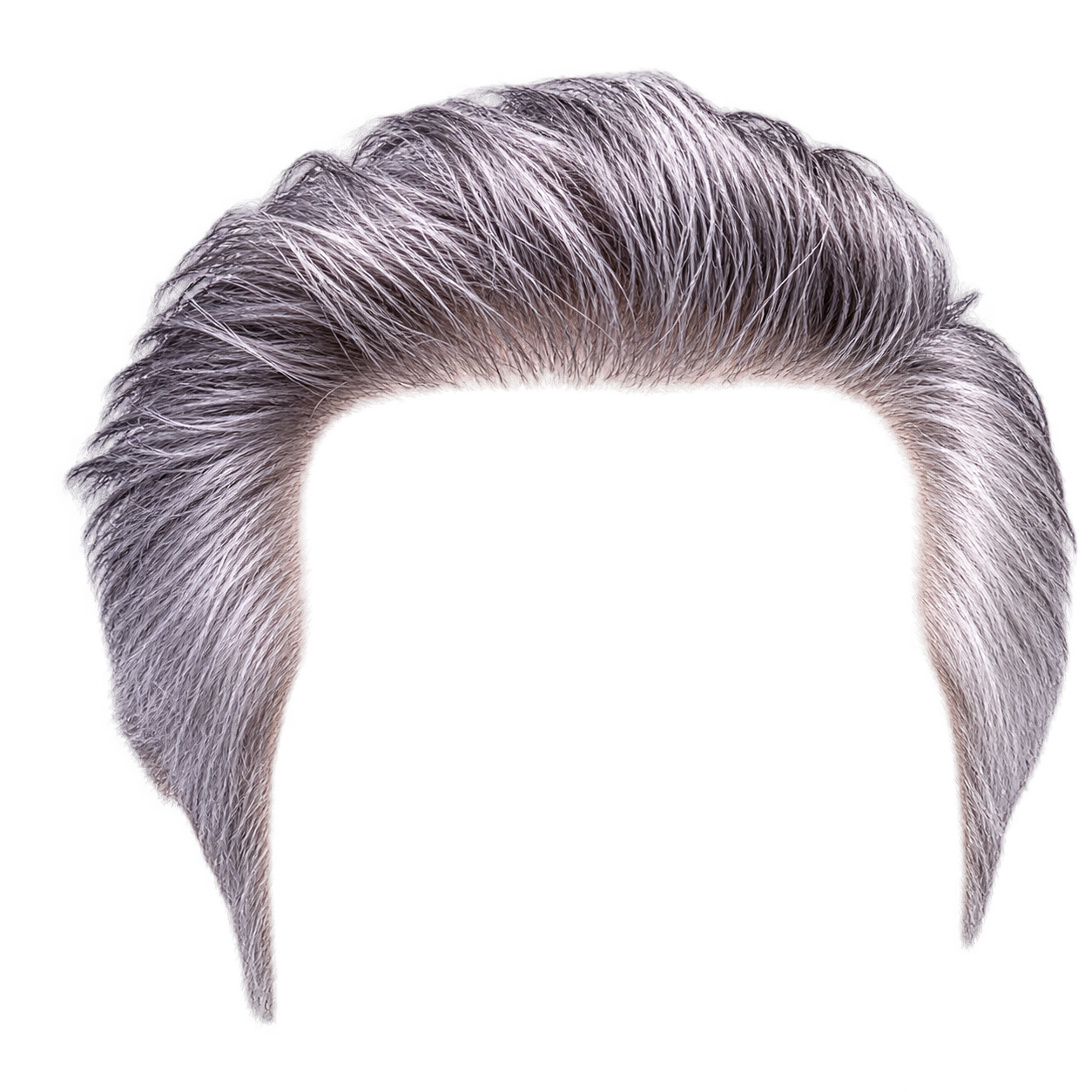
How does this look for mathcin hari?
Much closer. I’d call the hair ~8/10 matched now. The value structure is working; what’s left is mostly color character.
The left hair is still a little too neutral/silvery, while the right has more lavender/magenta contamination, especially through the top and side highlights. I would not purple-up the whole head—you’ll lose that believable gray.
For the left hair only, I’d try:
Tint: +5 to +8 magenta Temp: +2 or +3 warmer Purple saturation: +8–12 Magenta saturation: +5–8 Highlights: +5–10 Blacks: -3 to -5, just to retain the dark strand separation
Then make a very soft second mask over the crown/top-facing hair and add another +5-ish magenta/purple there. That’s where the right guy is getting most of that violet light.
One other difference: the left beard is slightly cleaner/whiter than the right. I’d put maybe 5% of that same lavender cast into the beard shadows, but leave the white whisker highlights alone.
Don’t push it much farther than that. You’ve gotten past “different hair color”; now it reads more like the same gray hair under slightly different lighting, which is exactly where you want it.
okay, guy on the right skin needs to be like guy on left but in a sundown magic hour ... am i too yell0w? lik ethis? Quick, get my skin on th eleft to match right, only she's outside in the sun
Yep — left needs to come toward the right woman’s base skin color, but keep outdoor sun warmth on top.
So the move is:
cool and neutralize the base skin without removing the sunlit peach highlights
What’s off on the left now

She’s reading:
a little too red/orange a little too saturated slightly deeper/tanner than the right woman hair is also warmer/reddier than the right
The right woman feels:
lighter more neutral beige slightly less red a little more yellow/neutral in the mids, but not golden Fastest path in Photoshop 1) Camera Raw on left woman only
If you want the quickest global move:
Temp: slightly down Tint: slightly down if she’s too pink/magenta Saturation: tiny bit down Orange Saturation: down a little Orange Luminance: up a little Red Saturation: down a touch
That usually gets you close fast.
What you’re trying to do: make the skin lighter less ruddy less orange-red but still keep sunlit warmth in the highlights 2) Best targeted move: Selective Color
On left skin only:
In Reds Cyan: add a tiny bit Magenta: reduce a little Yellow: reduce a little Black: reduce slightly if she’s too heavy/dark In Yellows reduce Yellow a little if she still feels too golden maybe reduce Black slightly to open the skin
This will get her closer to the woman on the right faster than broad global temp shifts.
3) Preserve the “outside in the sun” look
After neutralizing the skin, if she loses her outdoor feel:
Add a very soft warm Photo Filter / Color Balance / clipped layer only into the sun-facing planes:
top of cheek forehead shoulder arm nose bridge
That way:
base skin = right woman lighting warmth = left woman in sun
That’s the key.
Super quick visual rule
If matching to the right:
Left woman needs: less red less orange slightly brighter slightly less saturated
But do not flatten out the highlight warmth.
If I were doing it fast-fast Mask left skin Camera Raw: Temp slightly cooler Saturation down a touch Orange Sat down Orange Lum up Selective Color: pull a little red/orange out Paint back a warm glow into highlights if needed One-sentence goal
You want her to feel like:
the same skin family as the woman on the right, but photographed outdoors at golden hour.
If you want, I can give you actual slider amounts like “Orange Sat -12, Orange Lum +10” style.
how abou ther hair, how do i get a sort of blonde direction
Yeah — her hair on the left is reading auburn/chestnut. To push it toward the woman on the right, you want caramel / dark blonde, not just “add yellow.”
The big moves are: remove red/magenta, lift the midtones, then introduce beige-gold.
Fast Photoshop route:
Mask the hair. Add Hue/Saturation: Reds: Saturation around -20 to -35 Reds: Hue a little toward yellow, roughly +5 to +10 Magentas: Saturation -20-ish Add a Curves layer and lift the midtones maybe ⅓ stop. Don’t lift the blacks much — you still want depth at the roots. Add Selective Color: Reds: Magenta -10 to -20, Yellow +5 to +10 Yellows: Cyan -5, Yellow +5-ish, Black -5 to -10 Neutrals: tiny reduction in Magenta and Black if it still feels brown-red.
The important bit: don’t make the shadows yellow. Keep the roots/shadows a neutral brown, and let the blonde/caramel show up mostly in the midtones and sun-facing strands.
For this particular image, I’d aim for warm honey/caramel blonde, because she’s outdoors. The right woman’s hair is more neutral beige-blonde; on the left, the sunlight can legitimately push it a little more golden.
If it gets too “orange blonde,” you’ve gone too far in Yellow without removing enough Red/Magenta. The correction is usually less red first, then brighten, then add gold.
 Home | About | Full of Stars | Contact | HeartCartography
“May your seas be wide enough for wonder, your harbor always waiting, and your light never fail when another soul is searching.” – The Lantern Keeper